You Won't Believe This Isn't a Hotel
This apartment in Jerusalem Estates is intended to be an Airbnb. I wanted it to be so magnificent that it would be a real prizewinner.
Once again the kitchen was previously installed, as were the flooring and bathroom tiles. Whatever exists will always be my starting point for colour and style. The white kitchen and grey speckled upper units, with white and grey Calacatta countertops and black taps, gave me white, grey, black — and of course speckled — to start with.
The entrance showpiece
There was a large area at the entranceway that beckoned for a real show-stopping piece. I imagine something first, then design it as a 3D plan to get clients on board and excited.
For materials I went for American walnut to add warmth, and a special gold acrylic — very expensive, shhh — for the console table, to give elegance and an almost hotel-lobby look.
The piece on the left with strip lighting inside is actually a hall closet.
Lighting, again
I've mentioned before how important lighting is. I wanted a clean finish where the light is suspended directly from the ceiling without a plate, and we got the desired result.
I continued with the same gold balled lighting above the kitchen island, but this time incorporated some black balls to bring out the existing black in the room.
A lot of careful planning goes into lighting systems — functionality, general lighting, and atmospheric and ambiance lighting. Concealed lighting around the room gives a whimsical glow above the sheer curtains, while strong direct lighting illuminates the painting.
I added American walnut wall-cladding slats again, finished with concealed lighting illuminating the fine wallpaper behind the seating area. A room and table set for a king.
The washing station
I like to stay with the same palette, textures and similar materials in an open space to create harmony throughout. So I chose unusual speckled tiles that echoed the speckled Formica opposite in the front hall, and the upper kitchen units.
I had the whole piece hung off the wall to accommodate peripheral concealed lighting, and completed the look with a sophisticated black basin and tap.
The guest rooms
Although I went bold in the entrance and living spaces, I wanted the bedrooms calmer, neutral and elegant, with only a touch of colour.
See how I painted the entrance wall sage green and accented the bedroom with the same palette. How observant are you — did you notice how the greenery coordinates with the picture?
This room sleeps four, as both beds have trundle pull-outs.
Those familiar with Jerusalem Estates apartments will know about the dropped sheetrock above the windows, which makes window treatments challenging. I came up with a fixed valance above the sheers to obscure it.
Can you see how the square bordered look of both headboards and closet is edged in gold? The circular integrated handle coordinates with the circular gold light fixture.
In the second guest room I used the same base colours, accenting with stronger navy, taupes and neutrals in the bed scarves and throw pillows, and added under-unit lighting for a floating look.
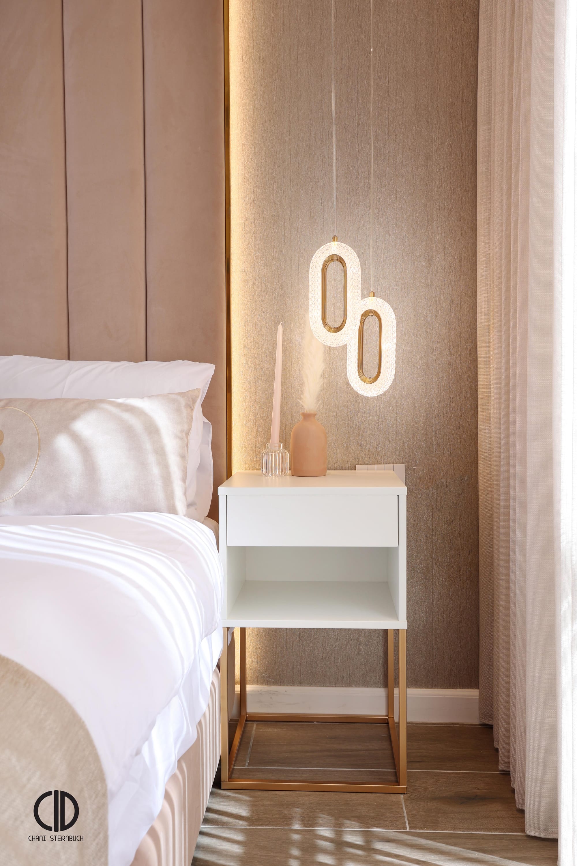
The master bedroom
Simply magical.
Credits
Tiles and faucets: Inside · Beds, headboards, table, chairs: Twin Concept · Window treatments: Home D Design · Couch and coffee table: Italsofa (D-City) · Accessories: mainly D-City · Kitchenware and tableware: Food Appeal · Front hall and closets: my carpenter · Photography: Leah Zachariash