From Simple to Simply Stunning
Let me show you around my latest home makeover in Jerusalem Estates, taking an apartment from simple to simply stunning.
Mrs O. reached out because her already-furnished apartment, rented out long term, needed upgrading to the standard for a short-term rental. After seeing pictures, the conversation went something like this:
Me: "Okay! Well, em, nice, em — but what would you like me to do here?" Mrs O.: "And better yet, would there be any possibility of keeping the existing furniture that my brother-in-law so kindly picked out?" Me: Double "okaaay." (Deep breath.) Well then, what exactly was left for me to do? You know what — I'll go take a look at the apartment and see what inspiration comes.
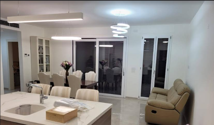
And what I saw was a standard-looking apartment.
Start by taking away
Too many pendant light fixtures for one open space hit me first — I was getting the feeling of a lighting showroom. So I started with סור מרע and got rid of the pendants. Then it was time for ועשה טוב, and I went looking for something original.
Then I found the gem that would be the starting point for the whole apartment: a glass turquoise and gold pendant light. I instinctively knew it would work, so long as I incorporated other turquoise elements in the space.
The dining room feature
What crazy feature could I integrate above the dining table in turquoise? It had to be something not hanging, as I was keeping the pendant above the kitchen island. (Yes — one pendant in an open space, generally speaking. There are exceptions.)
This took much intricate planning and resourcing to find the right material for the desired effect.
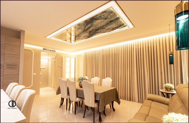
You're observing a lot more than the lighting, I know. You've noticed the curtains — curtains add instant glamour to an area. And a complete paint job in the right shade takes a boring, white-walled, hospital-looking apartment up five notches instantly.
Working with furniture you didn't choose
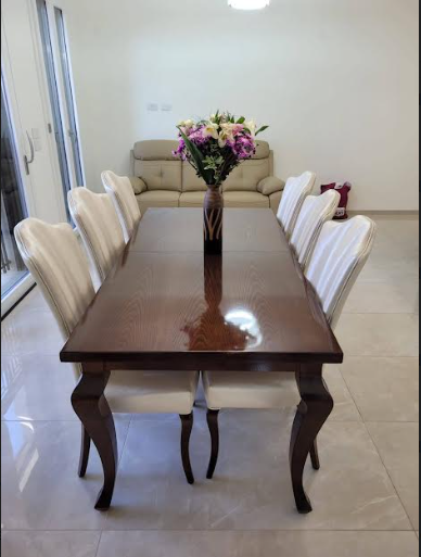
Honestly, I didn't have all that positive a feeling towards this table and chair set. But once I worked on the background with it in mind, it took on a new look.
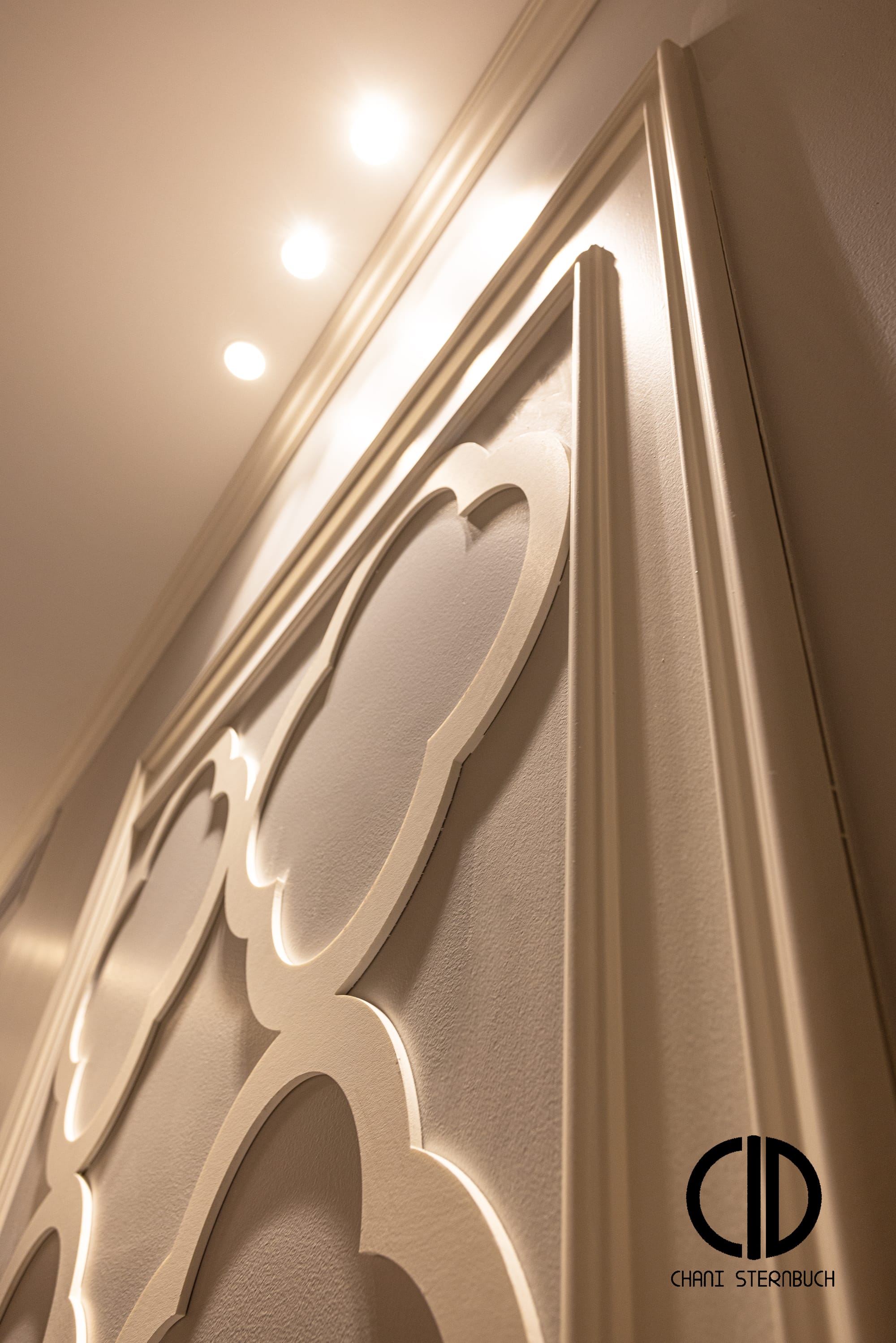
How? The concave shape of the chair gave me the inspiration for the contour in the wall mouldings. The calculations of the bordered frames had to be accurate to the centimetre, so that the turquoise pendants end up in the centre of the frame.
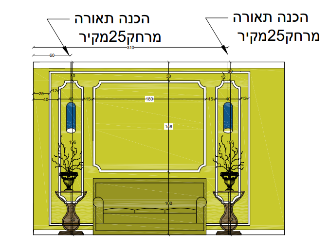
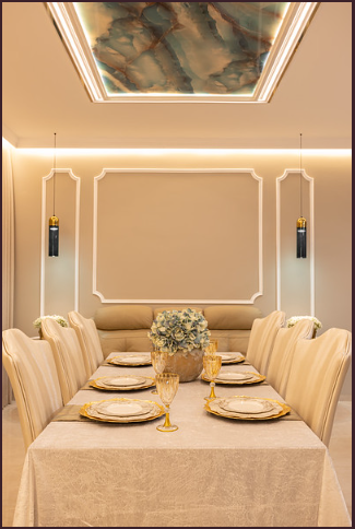
And there you have it: perfect symmetry.
Why is symmetry pleasing to the eye? "Symmetry represents order, and we crave order in this strange universe we find ourselves in. It helps us make sense of the world around us." — Alan Lightman
The washing station
I love the dramatic contrast of turquoise and gold against the marble background. The illuminated carpentry works like a charm to complete the look.
The kitchen
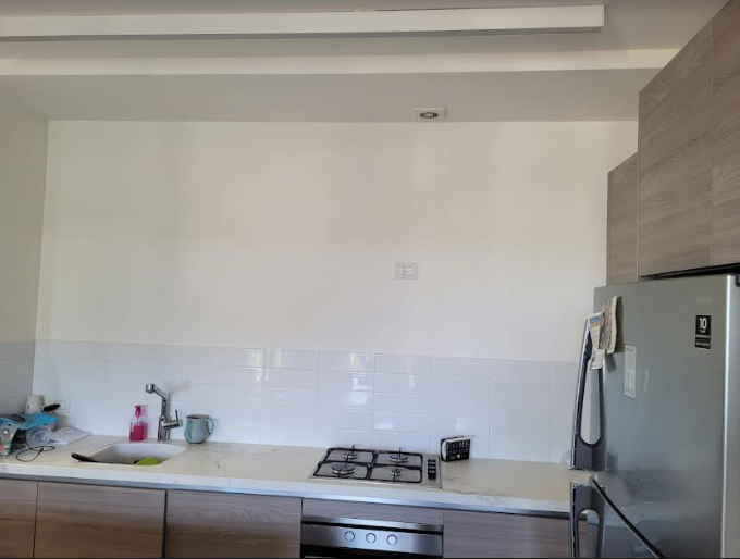
When a kitchen lacks top units it has a very basic, standard look, like something straight from the kablan — and the white subway tiles were a no-no. So adding top units was a given.
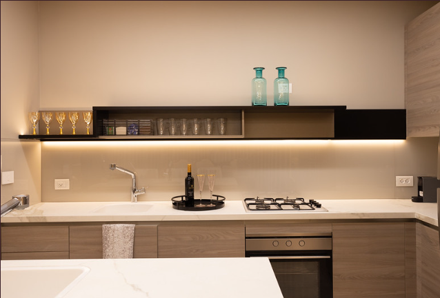
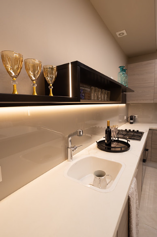
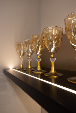
Because this would be a short-stay apartment, storage and functionality were less of a priority than aesthetics. I wanted something stunning that would be a showcase element in an otherwise nondescript kitchen.
I contemplated colour options until I settled on a neutral close to the current Formica, contrasted with a black Shleiflack S-shaped shelf. I did away with the brick backsplash and replaced it with glass coloured to match the wall (Tambur 1571p, "Ordinary Love"), beautifully synchronised with recessed lighting running along the upper shelving for that glow.
My favourite room
Why? Because this bedroom featured a simple high-riser which would obviously be removed, giving me a clean canvas.
The upholstered panelled sliding-door closet and bunk bed, set against the contrasting blue wall, is alluring. Using the same fabrics as the closet in small quantity in the Roman shade and throw pillows ties the room together and gives that custom sense. I continued the moulding panels along the room at the same height and intervals as the closet, for continuity.
A far cry from what the room was.
The master bedroom
Fully furnished already. Grey and cream were the given colours, so I supplemented that in the textiles with various pillow compositions, keeping the scheme monochromatic and harmonious.
When I found this fabric I intuitively knew it would pick the room up a notch or two. (Note how the valance is a fake, in order to work with the Roman shade above the beds and to conceal the infamous dropped sheetrock that Jerusalem Estates apartments have.)
You know that feeling of satisfaction when you find the hairband in the perfect shade to match your girl's dress? That's what finding this shaped wall decor felt like.
Now turn around. Here we had a basic Formica closet — should I dump it and redo? Shame, though; it works with the room. So: the magic for almost any dull-looking spot is to add lighting. These singular closet-based lights added the spark that was needed.
Credits
Textiles: Home D Design · Mouldings: Best Decor · Wallpaper: Miller · Washing station: Inside · Kids' room furniture: Twin Concept · Kitchenware: Food Appeal · Recommendation: Brud Group · Photography: Cheved Kleinblatt